Benjamin Frailey, Colin Mulron, Isa Pino
Time Frame: 16 days, February 2019
Project Goal:
To create a replacement for the current five-star rating and review system that Lyft uses to track and reward drivers in their system.
Documentation:
Download it HERE
Scope
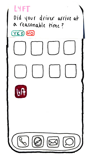
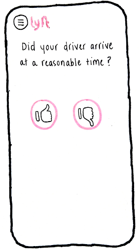
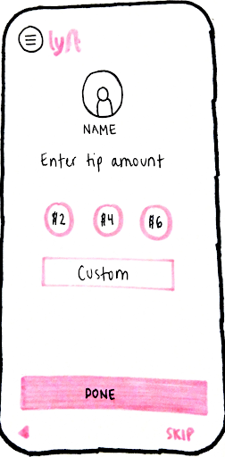
We tried to scope it down to make sure we were not biting off more than we could chew. we focused n the passenger rating the driver, and trying to accomplish a few things withing that. We wanted to humanize the driver, make the process speedy, and give the drier actual feedback to improve on.
Main Solution
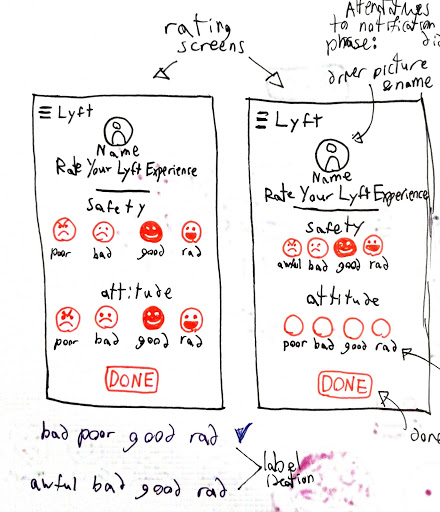
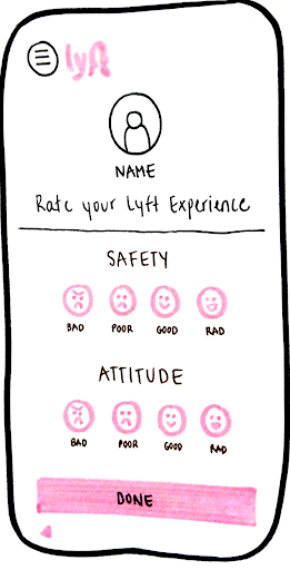
After a lot of ideation different ideas, and a few full circles that brought us back to what was essentially the 5 star system but with a different skin. We started looking at a “tapping” option, where you had to tap to add or take away half a star, and the default score was 3.5 stars in an attempt to fix the overly high rating necessary to stay approved by Lyft. We also were looking at using categorical sliders, to have specific feedback for the driver. This slider option is what we decided to expand on.
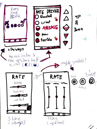
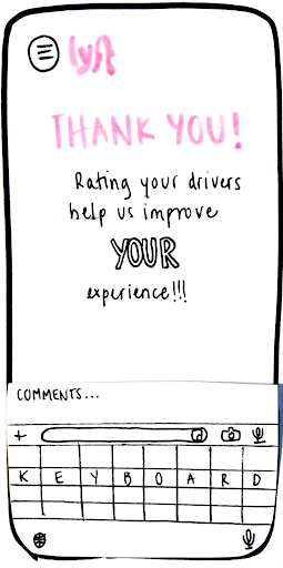
As we continued on with the process, we continued to ideate through different designs to design sliders, eventually we circled back to an idea that was close to the tapping, but with 4 points instead of 5 and using emojis.
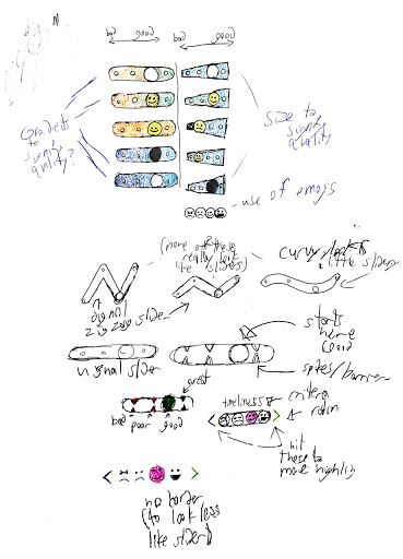
This was some rough ideation on how to continue the slider idea. We tried many things, gradients, size change, and what we eventually settled on was emojis. This is where we settled on 4 “checkpoints” where the slider icon, eventually settled to be a progressive emoji, would snap to. We realized how un-intuitive this would be if still used as a regular slider, and how the finger would cover it up. This lead us to having arrows to tap, bringing us back slightly to the tapping idea.
After usability testing, we saw we needed to make some changes, but that we were also headed in the right direction. The faces helped humanize the driver, and the experience being split in half didn’t have much or any negative effect. However, some button design was sub par and the borders around the face made them look too much like traditional sliders.
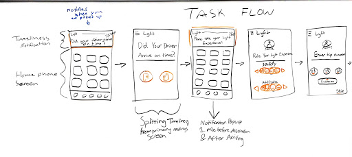
Final Prototype
Reflection
Overall, this project felt like a major increase from the first one, Sure, we had some hiccups here and there. We made 3 personas which was 2 too many for the scope of users we had, and we didn’t even apply them that much. We also had some difficulty researching this project, but at least that didn’t stop us from getting right to ideating and coming up with ideas. Improvement wise, I felt a lot more confident during this process. We already had one project under our belt, and an extra week to work, so we felt that we could much more easily dive right in. I really enjoyed this project and even though there is a lot i could improve on in both the design process, the documentation, and the solution itself. i feel proud of myself for accomplishing this and the process made me feel a lot more sure footed in the UX field.
