Acting as a UX Consultant to a local startup in late 2019 and early 2020
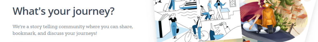
Willeder’s Purpose:
The vision the creator’s had for Willeder was a place where people could share their struggles and stories about their passions and careers. They wanted it to be defined by a couple key attributes that would make people want to share their stories here versus places like Instagram or LinkedIn
- A focus on the story and all the challenges and small victories that come with it, not just the end result.
- Less professionalism and a more intimate feel to encourage people to share honestly and openly
This was designed to get user to share the true story of their careers and projects, and then get recruiters connected to the site and have it make use as a more honest and open version of LinkedIn, where people did not have to put on a mask. The main problem the team was having was that people would use it for a little, and then drop using Willeder shortly after. So I came on to help create a desktop redesign and a mobile design that would hopefully help these issues.
You can either look at the designs here, or visit Willeder itself HERE
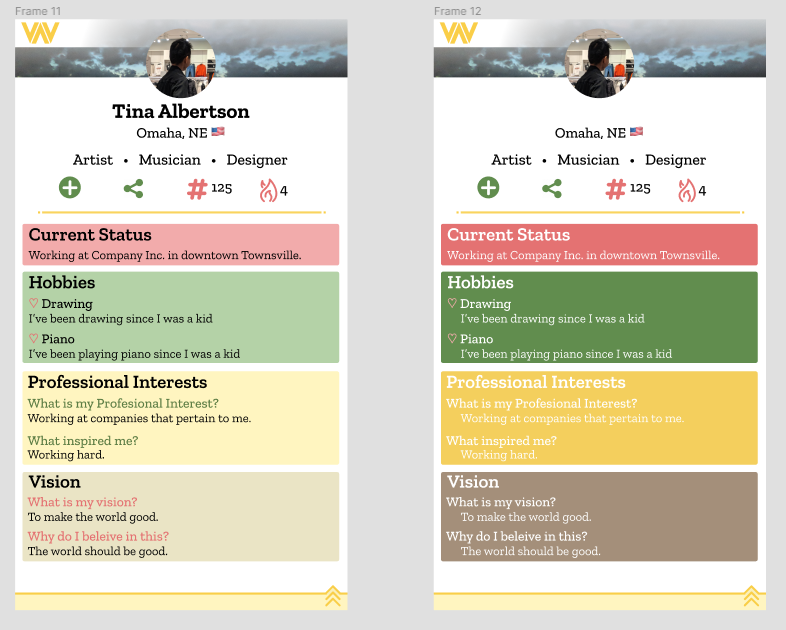
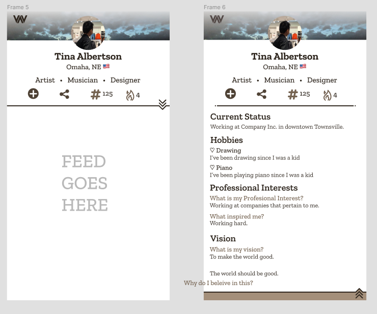
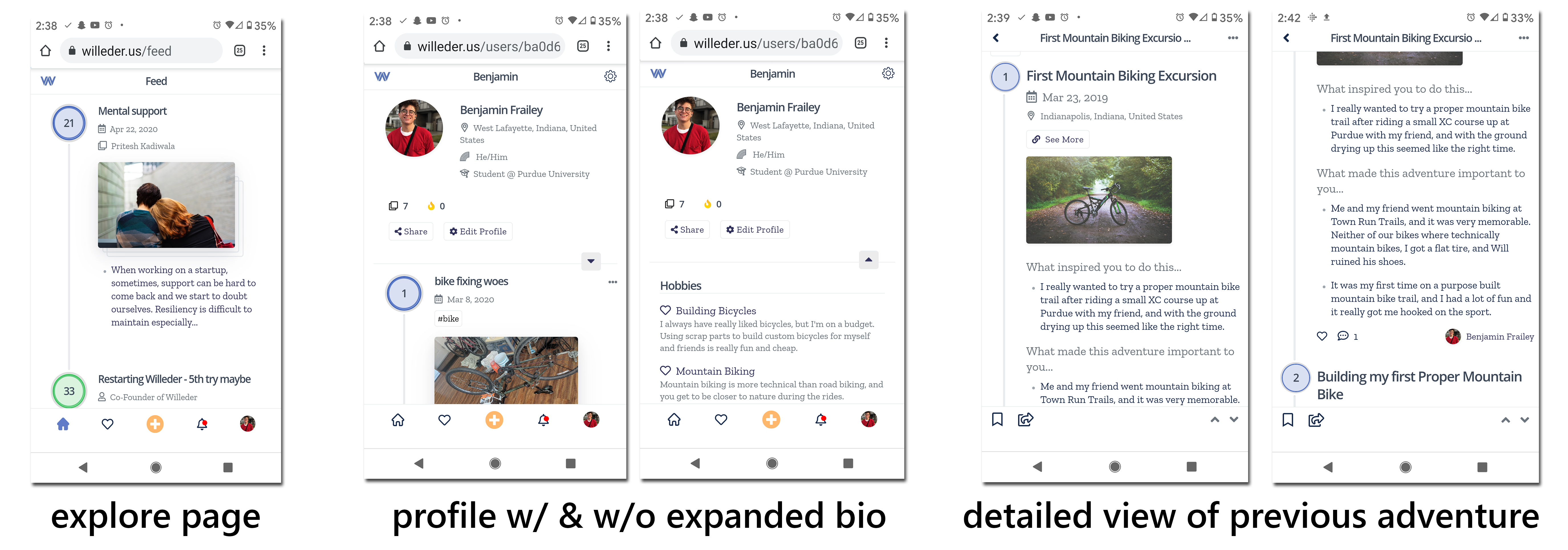
Desktop Redesign
Browsing
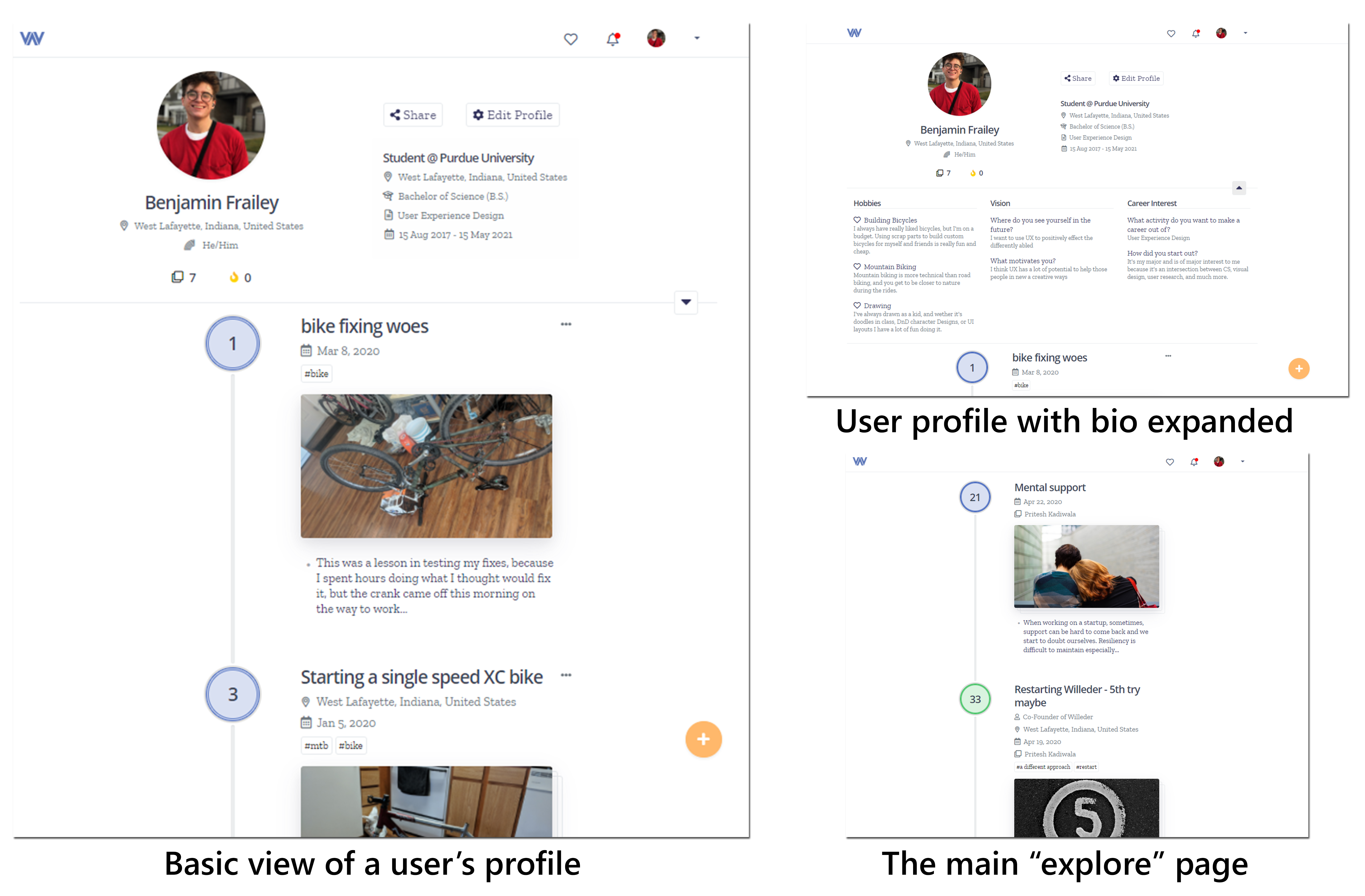
Thru many mood boards and experiments with color, a very simple color pallet and design was decided on to make the user feel like they had a blank canvas they could user in front of them.
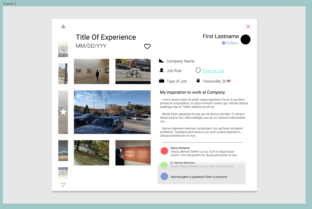
Uploading an Experience
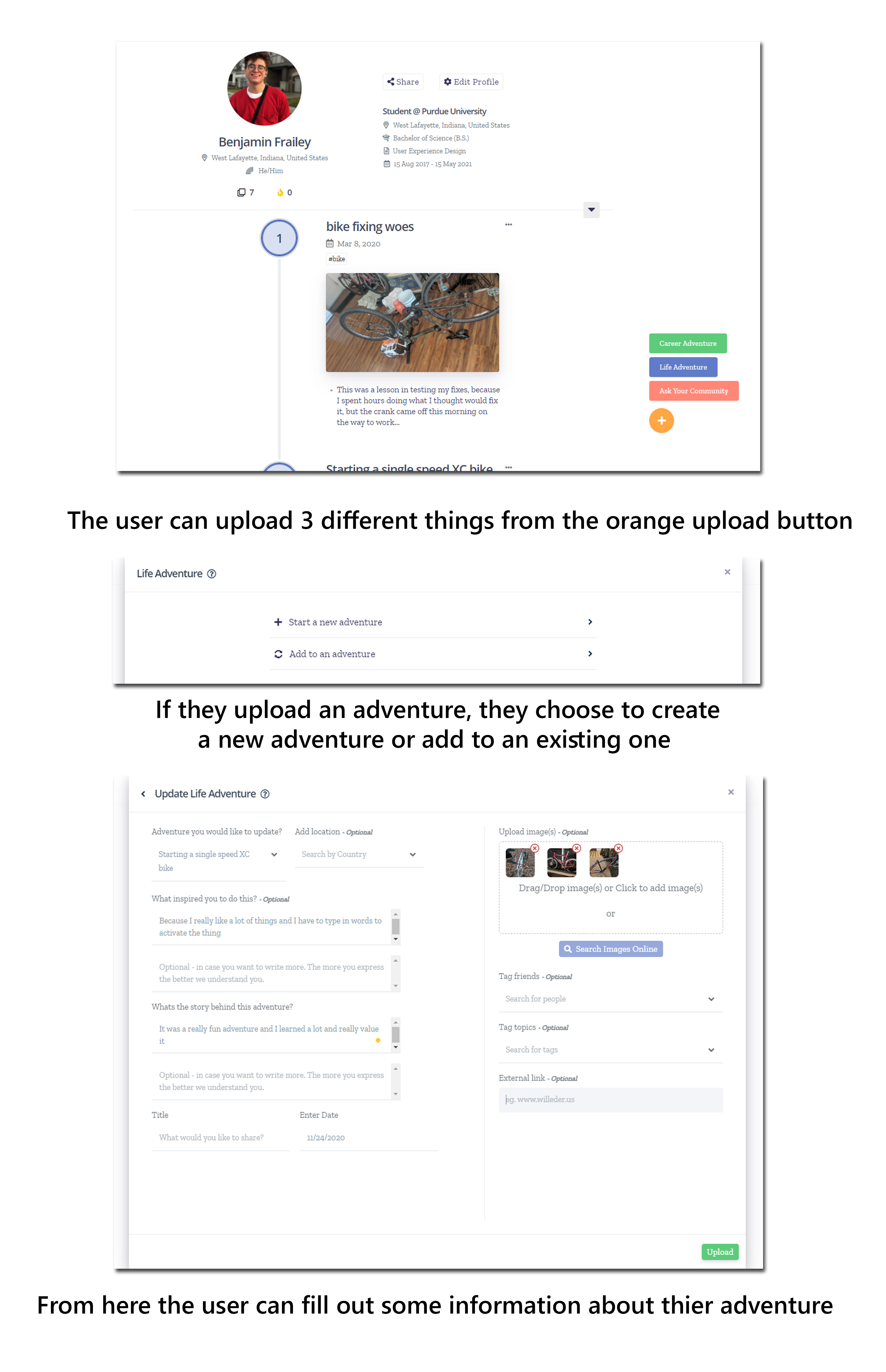
A lot of thought and time went into the uploading experience because through user research that’s where I found most people got bored and/or frustrated with the experience. Wording, the order of what the user filled out, and keeping it sparse were very important.
Mobile Design
Willeder had no mobile design except for some web responsiveness before cam in, so I did a lot to take the new desktop redesign and work it into a more on-the-move experience.
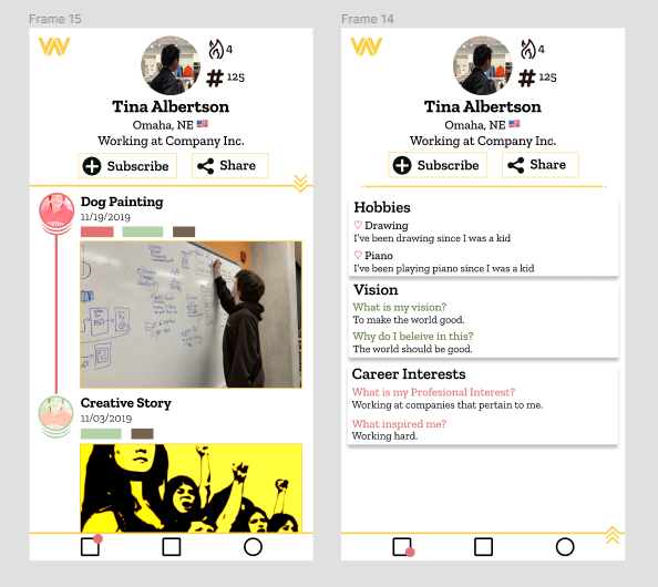
Browsing
Mobile Uploading
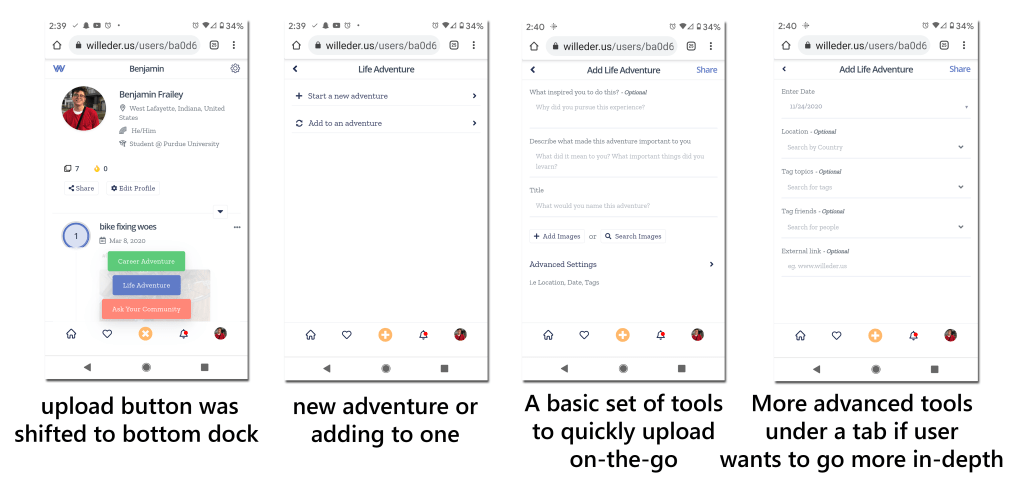
This version of uploading was very different than the desktop version because we found through research that users would upload different things on mobile than they did on desktop, so we tweaked it to fit the quicker adventures mobile users would upload.
Experience Synopsis
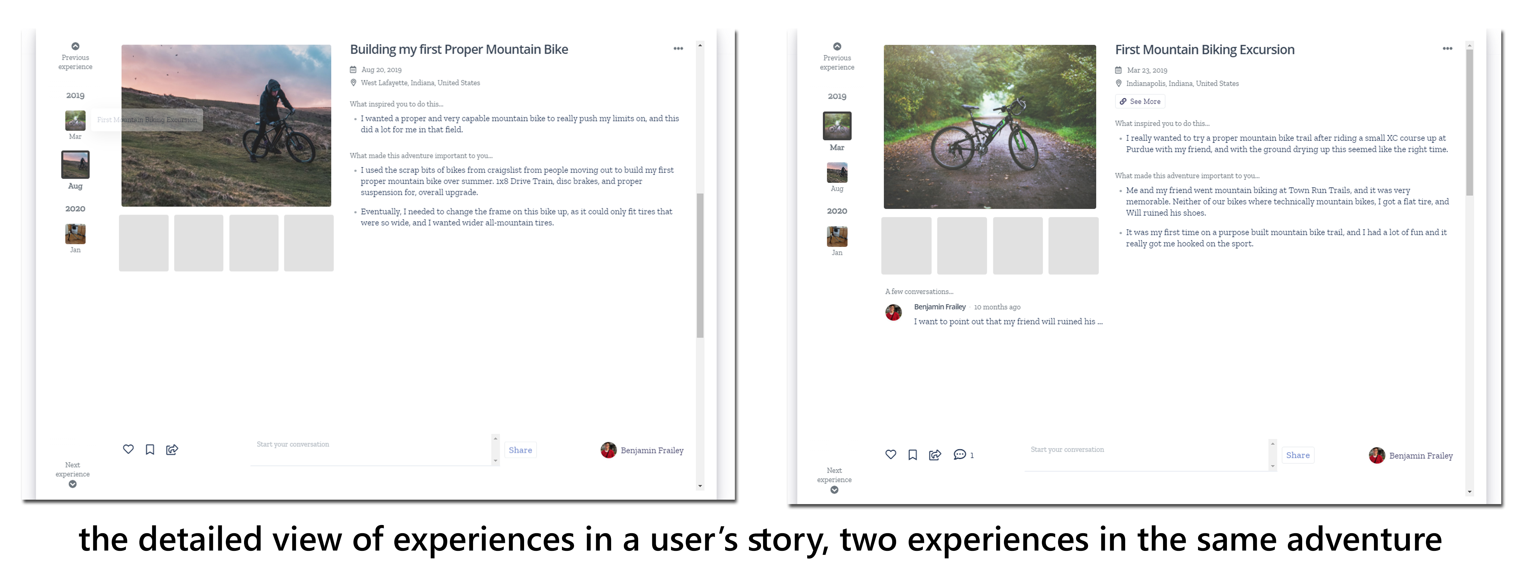
Willeder is aiming to let people post and communicate about their projects, accomplishments, and challenges in a close knit community. This is accomplished by created a profile that does not revolve along likes, or grandiose posts, but instead small steps that add up to separate adventures that come all together to create a person’s story. To emphasis this, the posts are connected to each other and displayed in a chronological timeline.
Research
Research is what lead a lot of the design decisions in this project. I did a lot of different research for Willeder including interviews, desirability testing, usability testing, and more. The major insights of all of this was:
- Users uploaded different things on mobile than desktop
- They did not enjoy having to write a lot to feel like they filled a post out, but also did not enjoy having their words limited.
- The original chronological display confused users and needed a lot of tidying up in my redesign.
- Wording had a large effect on user’s perceived purpose of the site.
Mockups & Iconography